Extract UI Items
jekyllrb.com
User Interface Discussion
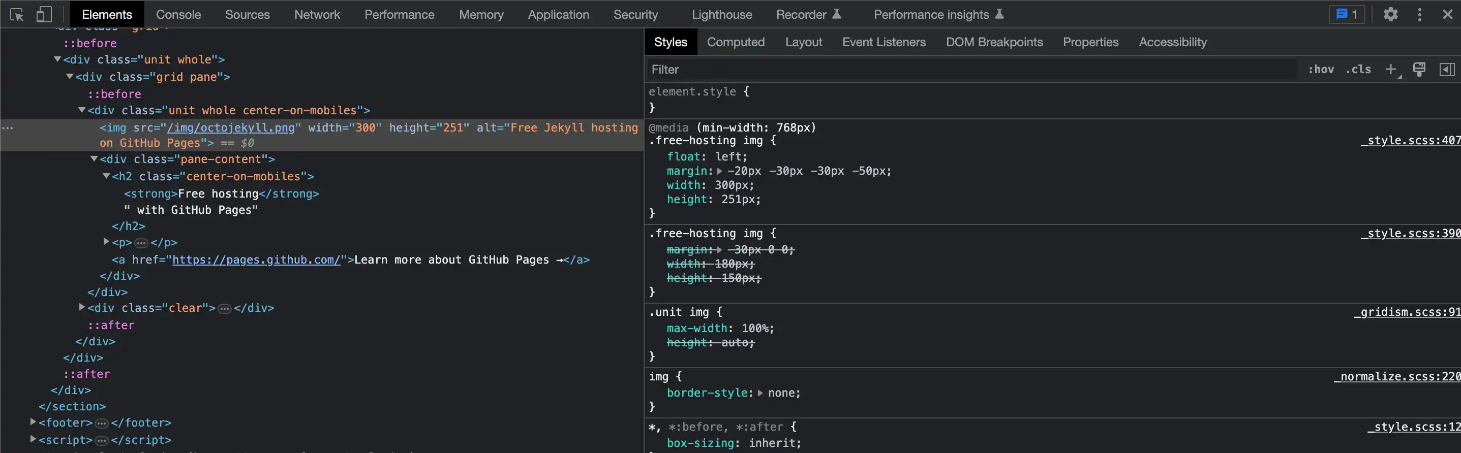
This Octojekyll is a cute little illustration that grabs my attention on the homepage. I like how it is offset from the surrounding graphics, like a sticker placed on top of the page.
I discovered the Octojekyll.png image inside of a <div>. In the CSS, the illustration is set to float:left and the graphic has margins in the negatives which move it even further left, shifting it off of the box behind it. The illustration also has been sized to a height of 251px; taller than the light gray box it sits on top of. The properties for the light gray box in the background show it has a content height of 201px and a lower padding of 30px, for a total of 231px. By this calculation, the Octojekyll's ears stand approximately 20px above the gray box.
jekyllrb.com/docs/
User Interface Discussion
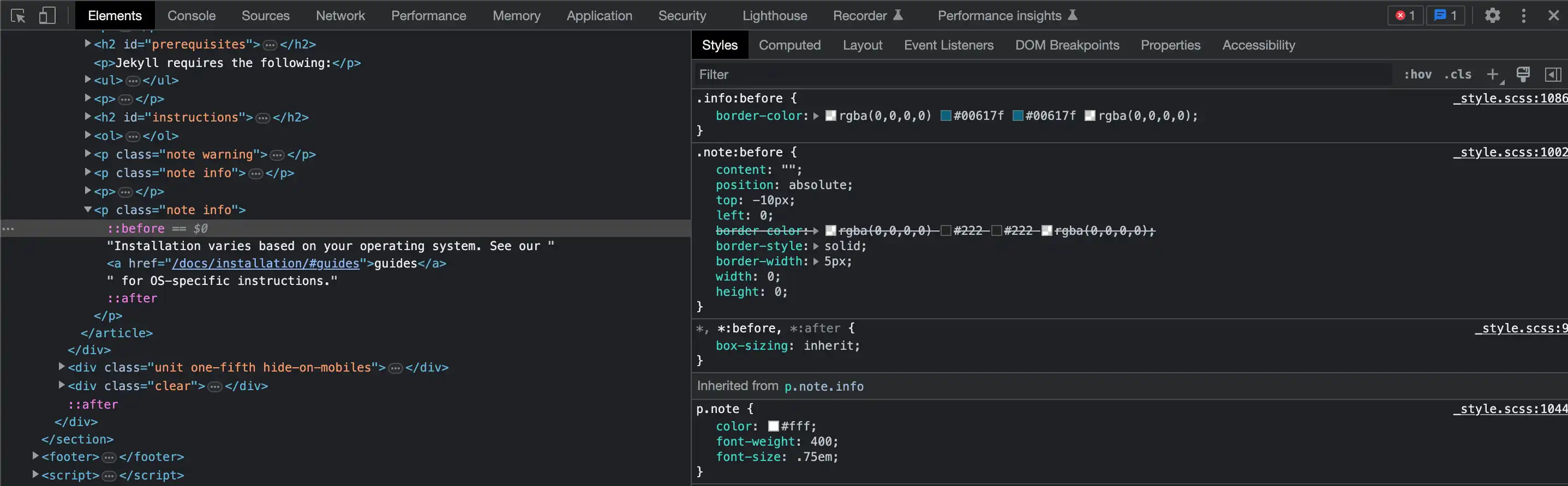
I think these little wrap-around tabs are really cute. They give dimension and personality. It's little details like this that may escape the conscience attention of someone passing through, but unconsciously, I think elements like this can make a user say to themselves, "There's just something about this site I find appealing". As a graphic designer who could easily make something like this happen in Adobe Illustrator, I am mystified at how someone can code this into existence for interactive website use.
I must admit, my limited coding skillset isn't lending much insight into the bones of this little tab, but I've given it my best effort nonetheless. I found this nested in a <p> inside of an <article> and specifically on a "::before" rule (I think). When adjusting the CSS, I can turn the tab on an off with the checkboxes under the .note:before rule. I can turn them off completely by unchecking the border style which is set to solid, or I can move them up and to the right by deselecting the position, top and left rules. For such a small element, these seem pretty advanced (or intimidating) to me.
jekyllrb.com/docs/step-by-step/01-setup/
User Interface Discussion
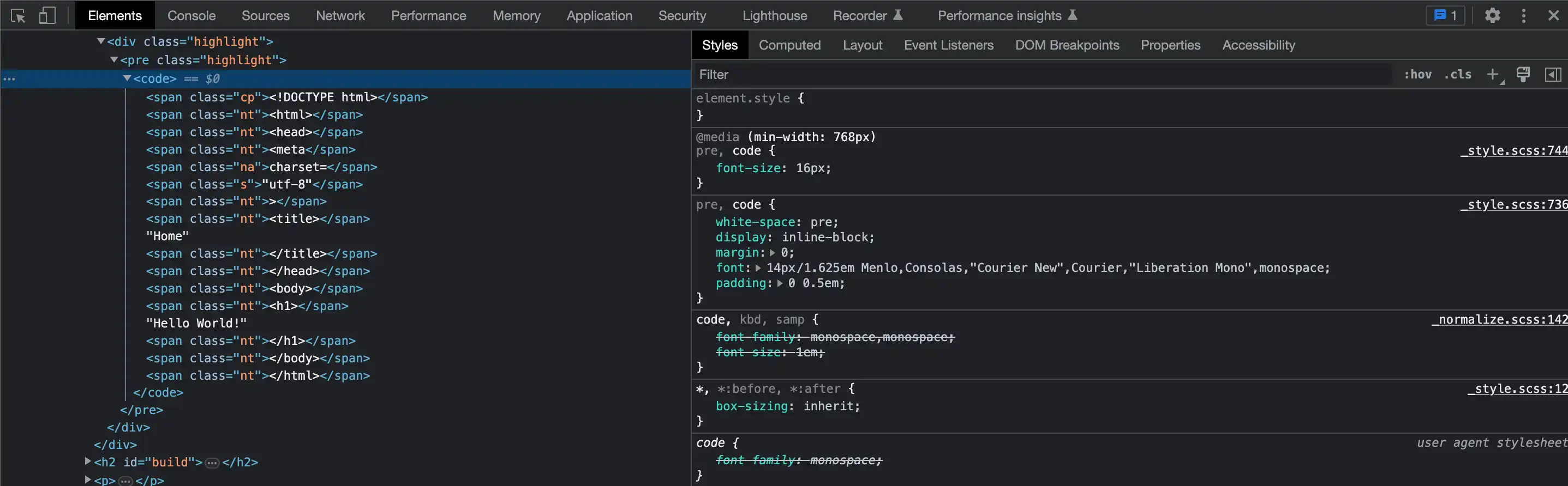
I think this colorful little box of html code is cute. I am personally drawn to the color pink, and against the black background, the bright colors add a lot of character to the overall appeal of this graphic. I also was curious about the way it is set up to look like real code, and I appreciate how it resembles the very first webpage I ever created.
I discovered this box buried inside a <div>. The black box itself is in a class="highlight". I haven't figured out how to turn the box off completely, but by unchecking the background color, it only leaves a black outline, though I haven't yet located the outline part of it. All the text which makes up the "code" is further inside the same <div>, between opening and closed <code> tags. Each word is further coded inside of opening and closed <span> tags and finally given their respective CSS classes, a different class for each color. The only other thing I haven't found is how they aligned the text to appear tabbed. That may be part of the <span> tag but I haven't been able to verify that.
jekyllrb.com/docs/configuration/
User Interface Discussion
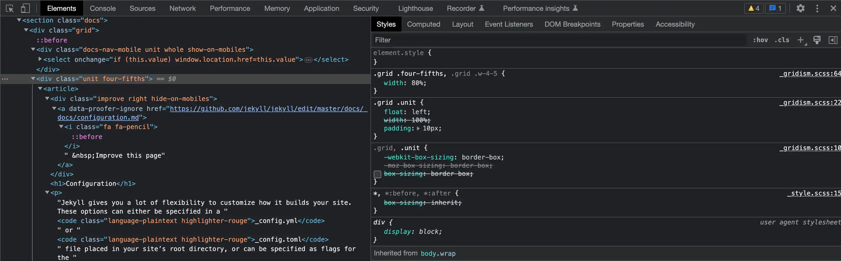
This little interactive arrow is really neat! It follows whichever item is selected from the list on the right. As cute as it is though, it is a frustrating little graphic. Although I have been able to identify most of the coded characteristics, in my search to figure out the whole of it, this graphic remained quite elusive; that is until I finally figured it out. I will do my best to explain it in words even though a guided tutorial would probably work better for me in this case.
Of what I've been able to identify, part of what makes this graphic function is inside of a <div> with a class="unit four-fifths". When I turn off the CSS "width: 80%", it pushes the list below the light gray box. By doing this, I was able to identify a separate gray triangle to the left of the list items. It is part of an anchor element inside a <ul>. The small arrow/triangle is actually a 20x20px square with 3 transparent rgba color values and one in #444, the same color as the light gray background above, hence, a triangle. This 3/4 transparent square is positioned -30px to the left of the text which, when placed back to its original location above (reselect width: 80%), the appearance of an interactive arrow/triangle that scrolls down the right side of the center box is preserved.